Now we don’t want to presume your investor pitch deck is bad, but if you are amongst the likes of LinkedIn, Uber, and YouTube – it very well might be. This post is going to dive into how to improve your investor pitch, specifically your pitch deck, using real pitch deck examples. Even if you are not the next YouTube, you need to be able to clearly and succinctly communicate your vision. And to do that, you need to design an amazing startup pitch deck; reviewing other investor deck examples can help you do that.
Search less. Close more.
Grow your revenue with all-in-one prospecting solutions powered by the leader in private-company data.
To show you the imperative of having not having a bad investor pitch deck, here is a quick look at what you are facing as an entrepreneur. Even if your startup received seed funding, your startup faces a pretty big cliff with hefty competition. Note, only about 15% of startups in each stage get acquired.
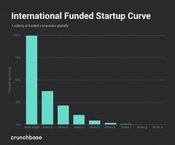
Now we’re not saying that a bad investor pitch deck will doom you (most of the companies below raised money – and sometimes a lot of it), but investors want (and need) to be convinced by your investor pitch. And the best way to do that? Telling your story with a beautiful investor pitch deck.
To find out what makes the best pitch decks incredible, we are going to examine some of the best and worst pitch deck examples we’ve seen and investigate how they could have turned a terrible slide into an incredible one. These examples just might help you create your own pitch deck template.
Let’s dive in.
1. Complex Concepts
TLDR: You can have really complex products, you just don’t want your investor pitch deck design to be really complicated.
Moz
2012: Raised $18M Series B
$29.1M in Total Funding
Still Operating
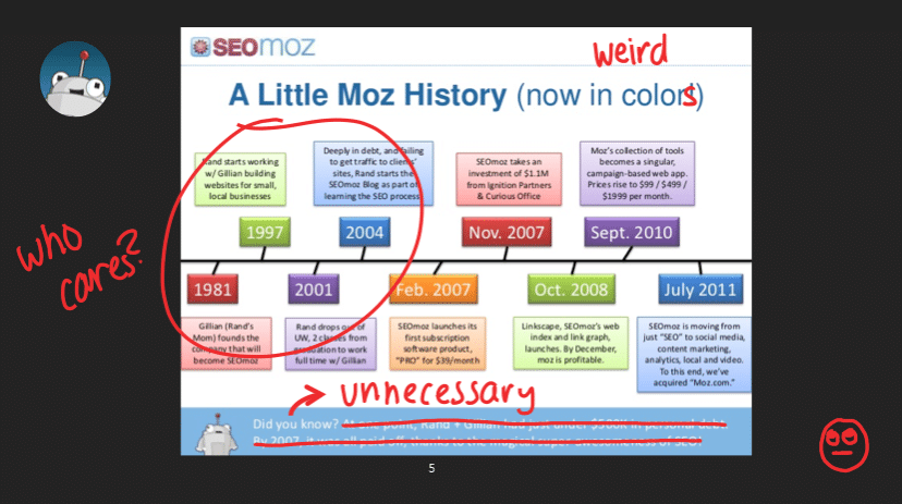
Timelines are super complicated. Don’t put all that shit on your slide. You don’t need to tell me how your mom started your company in 1981, don’t tell me that you were in debt, don’t tell me when you bought the domain name. Nobody cares about the “before.” All of that doesn’t matter and is just distracting to the truly important information.
Hiding in this crazy Moz timeline is when they raised money and when they started charging for their products and services. A timeline should give that information upfront, there’s no need for any of the other unnecessary information.
Nutanix
2014: Raised $140M Series E
$393.7M in Total Funding
Went Public in 2016
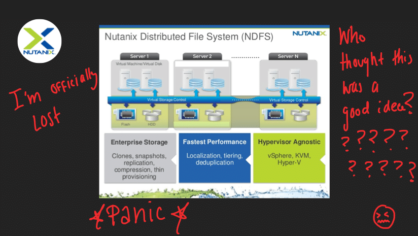
This is an outright terrible slide made up of terrible stock art that plagues our nightmares. What is that splash thing at the bottom? Why don’t the boxes line up? Not only are do the visuals look like they’ve come out of Windows 98, but this slide also makes it impossible to know what the value prop is.
Without a clear value prop, associates at the investment firms will look at the slides and say, “NEXT!”
Airbnb
2009: Raised $600K Seed
$4.39B in Total Funding
Still Operating
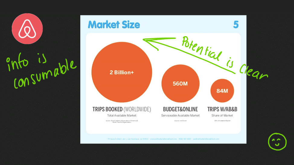
Ahh, now a good slide. This Airbnb pitch deck took a complicated concept (TAM, the total adjustable market) and made it simple and digestible. You don’t need the rest of the deck to understand this slide – start with key numbers that are compelling enough for investors.
Cadee
2011: Raised Undisclosed Seed
Undisclosed Total Funding
Still Operating
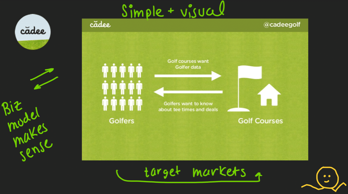
Another pretty good one. This slide makes it obvious what Cadee does, without needing the rest of the pitch deck. Although there might be machine learning and algorithms behind the scenes, we don’t need all of that on a single slide. Cadee created a slide that keeps it simple, even if their concepts and execution are complicated. Thumbs up.
2. Unreadable Text
TLDR: Make sure investors can read the text on your slide without having to whip out their monocle – that easy.
Standard Treasury
2014: Raised $2.7M Series A
$2.7M in Total Funding
Acquired by Silicon Valley Bank
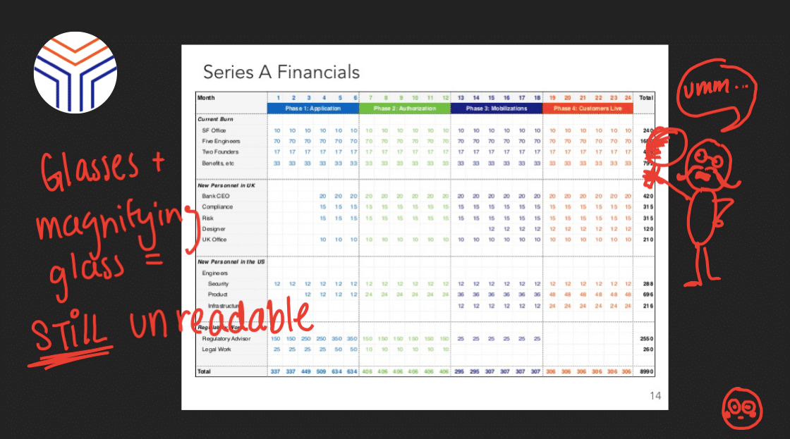
“So what are these crazy little numbers?”
“What costs are you not accounting for here?”
“What do you mean?” (no, not quoting Justin Bieber)
“What are you trying to say? What’s the point of this?”
A thousand questions cross an investor’s mind when they see this, and all this slide does it make it confusing. An investor can’t tell if you anticipate revenue or not. All this slide does is make it seem like you don’t understand your business or your cost structure.
Investors would hammer you on this slide, asking a number of questions that aren’t relevant and deviating you from your objective. Don’t put in slides because you know you have to, put in slides because you are adding value. Ask yourself, what is the story you’re trying to tell, even with your financial slide.
WeddingLovely
2011: Raised Undisclosed Seed
Undisclosed Total Funding
Still Operating
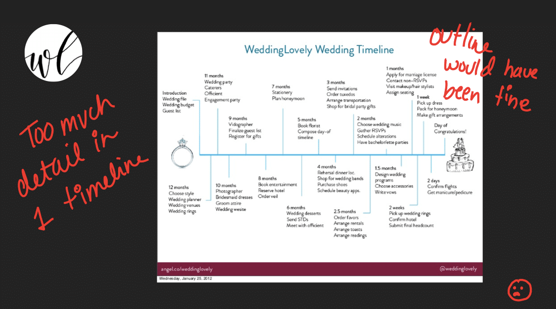
Again with the timelines.
Let’s just say while the investor is reading your slide, they get stuck on month six wondering what it means to send people an STD, and now they’ve totally missed the investor pitch. This could have easily been completed with bullets with touchpoints briefly summarized.
MetaCert
2016: Raised $1.2M Seed
$1.94M in Total Funding
Still Operating
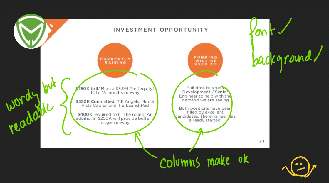
This one is pretty good. So maybe a little wordy, but at least the content is valuable. I can understand what you are doing with this funding – but maybe next time doesn’t use full sentences.
Reduce words to short bullets to give interesting details on why you need the money while explaining why this is relevant to you as an investor.
3. Confusing Visuals
TLDR: Visuals should engage the investor, not confuse and distract them. Visuals need to add to your presentation not deter from it.
Square
2011: Raised $100M Series C
$590.5M in Total Funding
Public in 2015
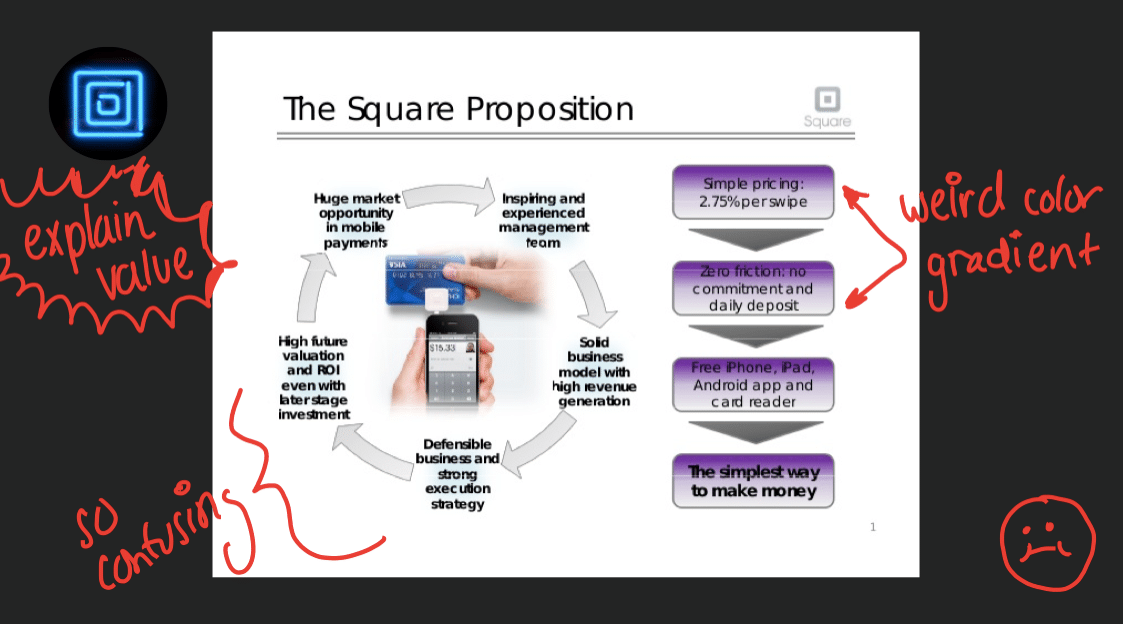
We just need to get something off our chest real fast. Square raised $100 million with this deck. ONE HUNDRED MILLION DOLLARS. And it’s our least favorite slide showing you here, but our favorite to rip apart 😇.
First, Square built what we like to call a circle of life slide. Please read it. These things should ideally build off each other. At a closer look, none of these things build into one another and make no sense as a cycle. People put in these graphics into their presentation to make it pretty, but it just makes it confusing.
What’s worse? A purple cascading funnel on the same slide, to boot.
Think these things through, please. And don’t use purple gradients. It’s annoying.
Buffer
2011: Raised $400K Angel
$3.9M in Total Funding
Still Operating
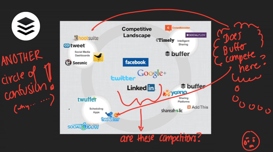
Again with the cycle of life.
Buffer, we love you but we have a lot of questions for you. Which of these icons is actually your competitor? Is it Facebook, LinkedIn, Google? Why are there small circles within the circle?
When you email this VC pitch deck design out, and you always will, investors will see this and not understand your competitive landscape and think that you have no understanding of who you are actually competing against.
Investors may also overlook you because your market looks way too big and you are going to inevitably get washed out or ignored.
TryM
2016: Raised $125K Seed
$125K in Total Funding
Stealth Mode
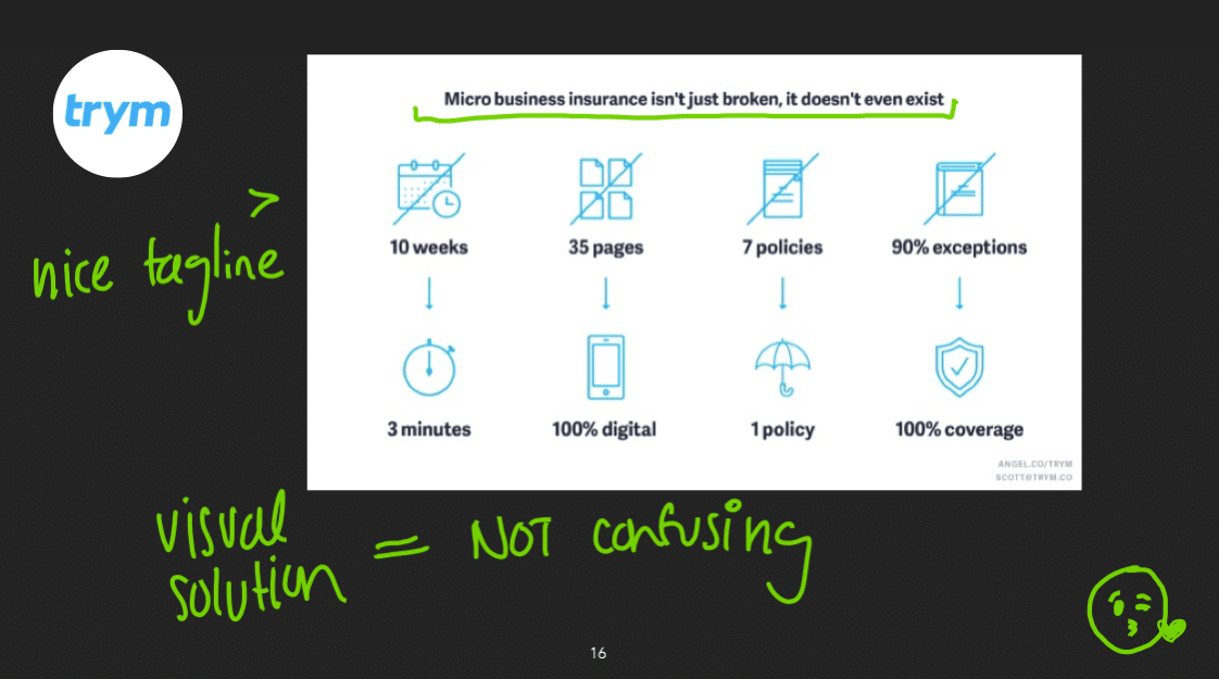
10 weeks to 3 minutes. 1 umbrella policy. All these numbers and graphics are easily understandable. This slide works – it’s is a great example of how to be compelling without being complicated.
4. Too Wordy
TLDR: Now is not the time for your novel.
Foursquare
2009: Raised $1.35M Series A
$207.3M in Total Funding
Still Operating
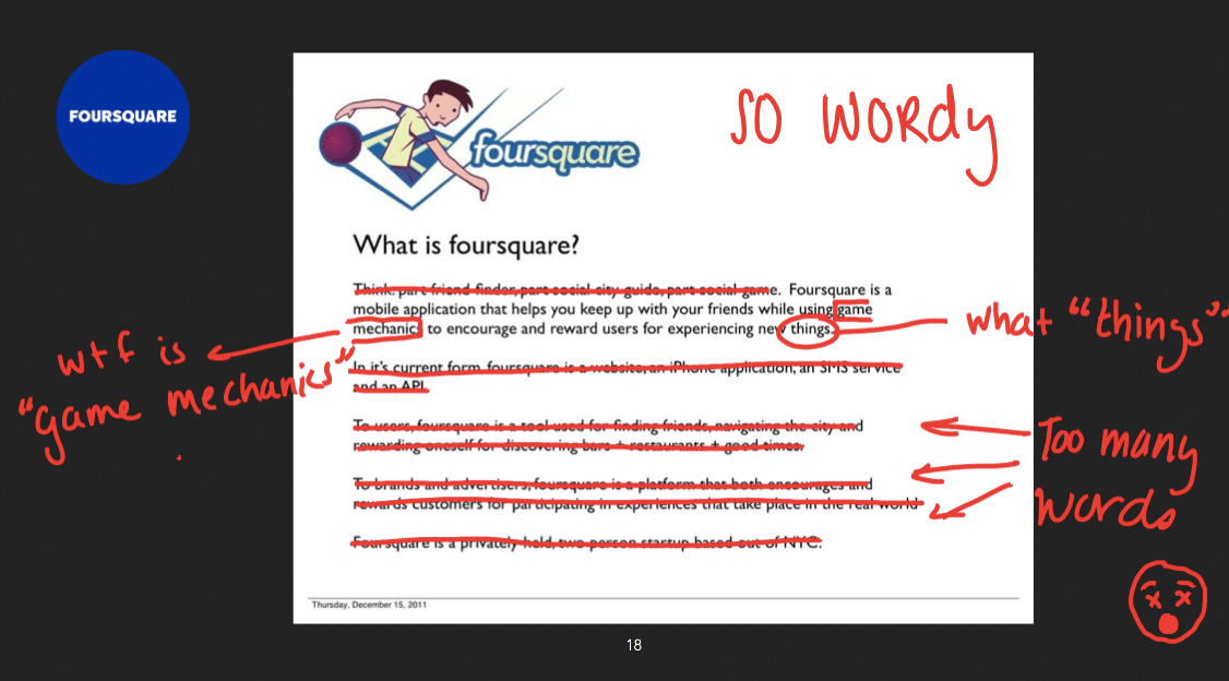
This is a prime example of a company that was neither precise nor intentional with their wording. What is “game mechanics?” Why are there four paragraphs to describe what is essentially an online check-in app?
And while we’re at it, make sure your logo makes sense and is a good fit for your business.
Claim Compass
2016: Raised Undisclosed Seed
Undisclosed Total Funding
Still Operating
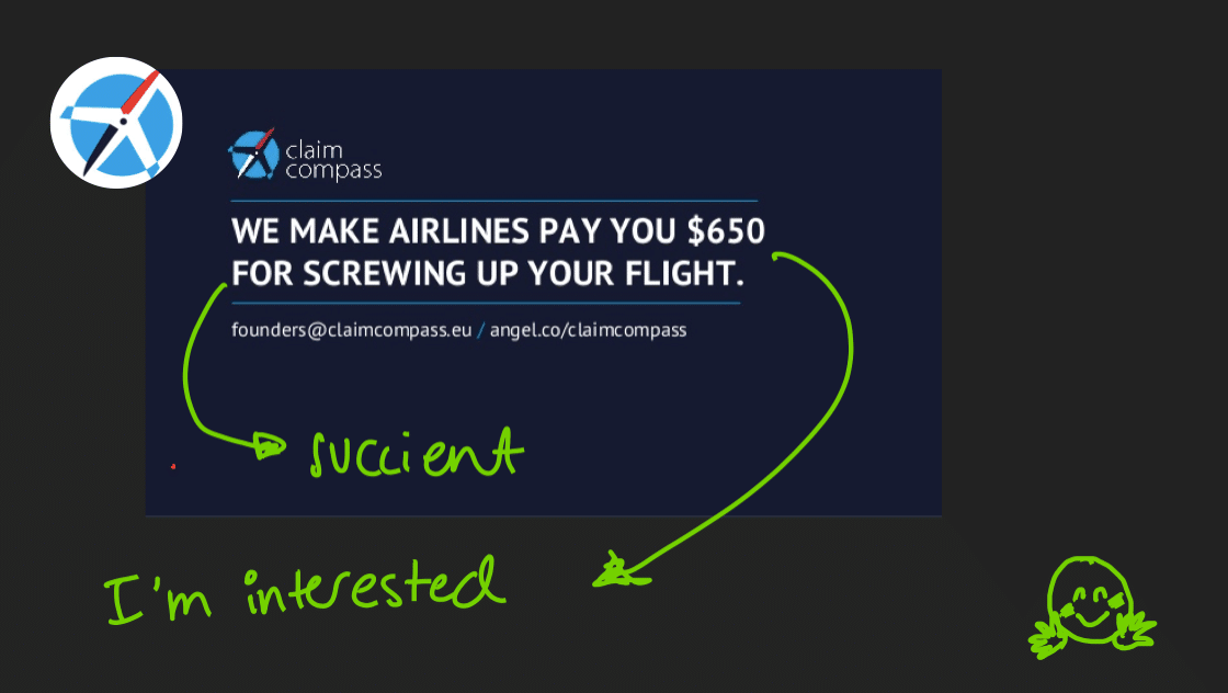
Here is a great example of less is more. Your words matter, but you don’t need a lot of them. This compelling 5-second investor pitch makes me want to read the whole deck and is part of the super exciting power that fewer words provide.
You don’t have to explain everything right off the bat. Tease the investors in with a little hint as to why your company would be interesting to me, and then dive into the details.
Metacert
2016: Raised $1.2M Seed
$1.94 in Total Funding
Still Operating
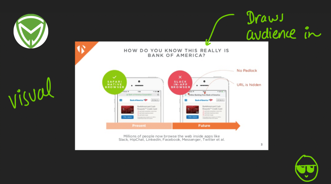
This slide is another great example. Use headers to creatively ask questions and rely on visuals to tell your story and draw in your audience.
5. Audience-Not-In-Mind
TLDR: Think through who you are sending these decks to, and adjust accordingly. Something you think is funny might just be seen as offensive.
Gofiture
2016: Raised Non-Equity Assistance
Undisclosed Total Funding
Still Operating

This whole thing is weird. First of all, there’s an image of all of China, but this slide only draws attention to 3 million of those people. Also, what’s with this weird red and blue font and crazy capitalization? And doesn’t everyone want first-class healthcare? This slide is troublesome, to say the least.
Up All Night
2016: Raised $500K Seed
$625K in Total Funding
Still Operating
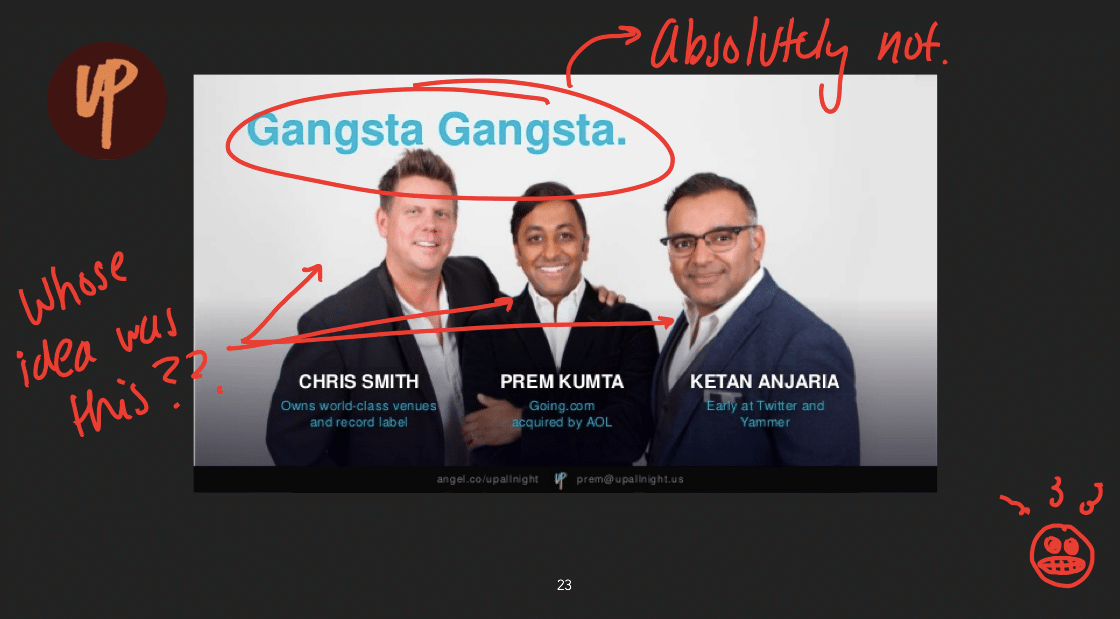
Not only does this slide wreak of bro attitude, but it’s also not what investors want to see. If you do find an investor who is interested in this imagery, it’s probably a red flag. Another point we’ll get back to is no one cares what you look like, we promise. Leave the full-blown pictures on your Tinder profiles and out of your pitch decks.
On the team slide, an investor wants to see those teeny blue letters. They want to know about your experience, plan and why you are a good fit for the job, not how you are a gangster-thief-mobster wannabe.
Uber
2009: Raised $200K Seed
$11.5B in Total Funding
Still Operating
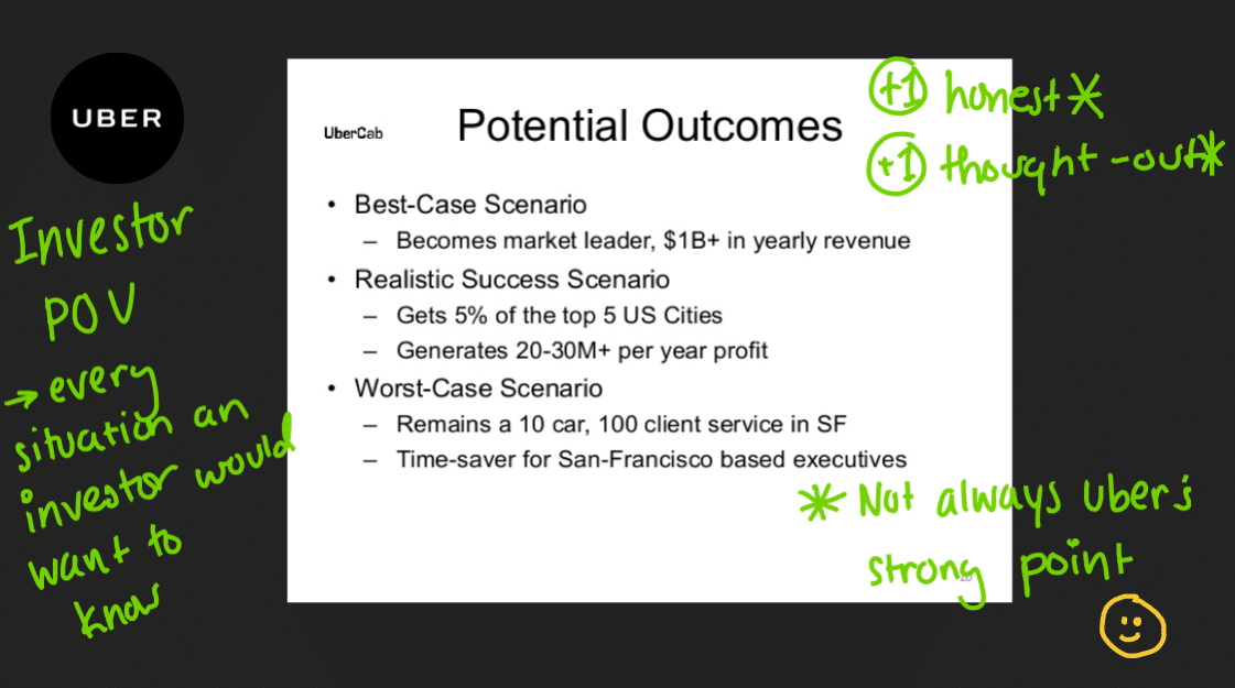
So Uber’s not great at a lot of things, but this slide is pretty good. There’s a clear description from an investor’s point of view and they managed to paint a compelling picture for potential investors.
6. Lots of Buzzwords
TLDR: Buzzwords turn investors off – no one wants to hear how you are an “Uber of” whatever. Just don’t.
Fittr
2014: Raised Undisclosed Seed
Undisclosed Total Funding
Not Operating
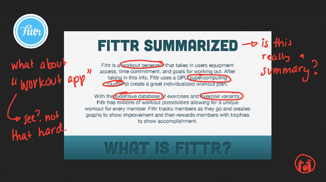
Workout generator. Supercomputing cluster. Extensive Database. Exercise Variants.
This slide contains an excruciating amount of unnecessary words. A simple visual and the mention of a “workout app” would have done just fine. How are businesses that struggle to explain their offerings in simple terms to investors ever going to sign customers and gain traction in the real world?
Carta, previously known as eShares
2015: Raised $7M Series A
$67.8M in Total Funding
Still Operating
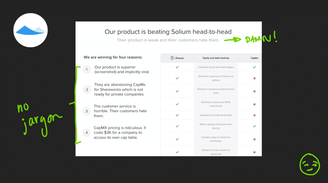
We love this crisp title and description. The bullet points are entirely straightforward and have no jargon. They tear apart their competitor swiftly and succinctly to make you ask yourself “Why would I ever choose Solium?” That’s exactly what you want as a presenter.
7. Unusual Metrics
TLDR: Be precise and transparent with your metrics.
Love With Food
2012: Raised $645K Seed
$2.09M in Total Funding
Still Operating
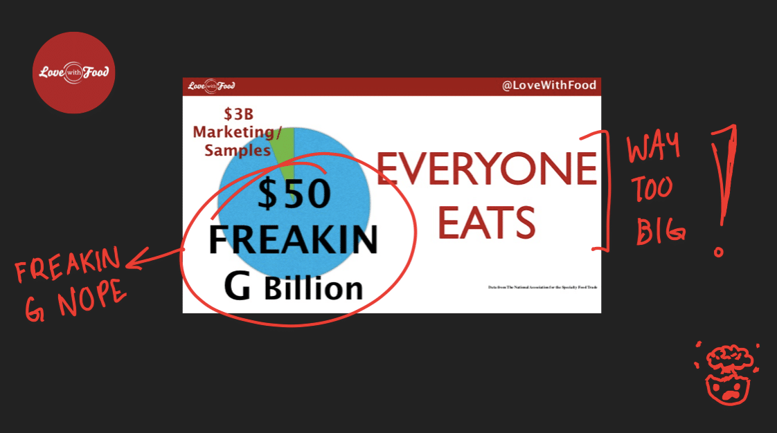
How Love With Food concluded that their TAM (total addressable market) is $50 billion is completely unknown. At this point, an investor would have completely discounted their entire slide as useless and not valuable.
A TAM slide needs to sell a story to help investors understand your idea and how you’re going to get your valuation while also showing compelling metrics.
Mapme
2015: Raised $1M Seed
$1M in Total Funding
Still Operating
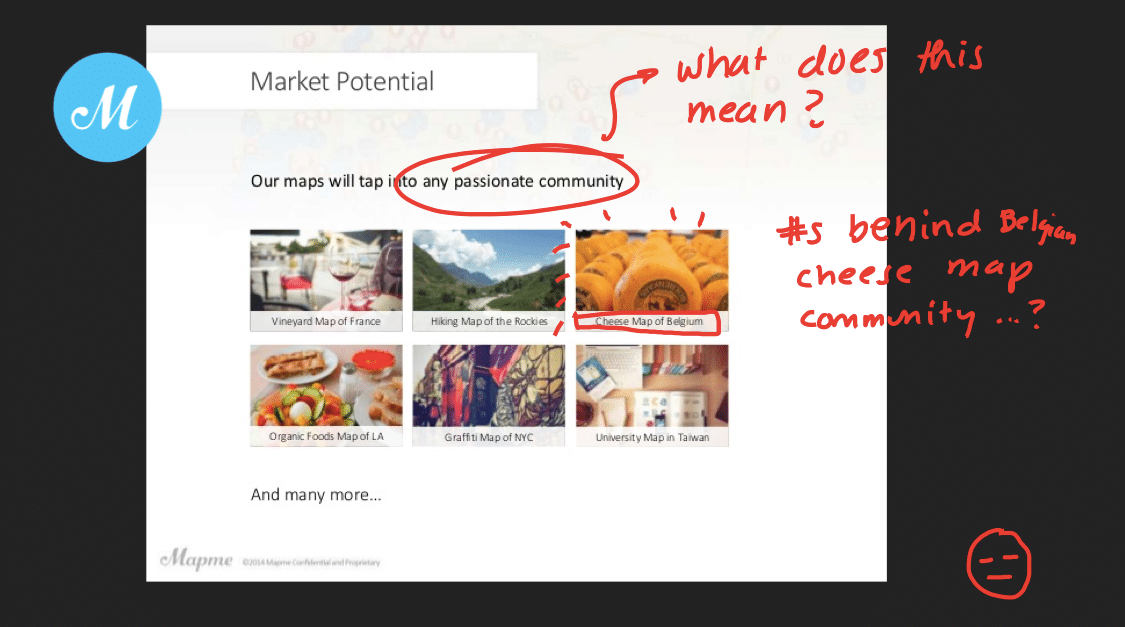
However interesting it is to know how many people are interested in the cheese map of Belgium, this slide is impossible to quantify. If an investor cannot clearly determine how many people are in the target market, they will have no issue skipping out on your cheese maps.
YouTube
2005: Raised $3.5M Series A
$11.5M in Total Funding
Acquired by Google
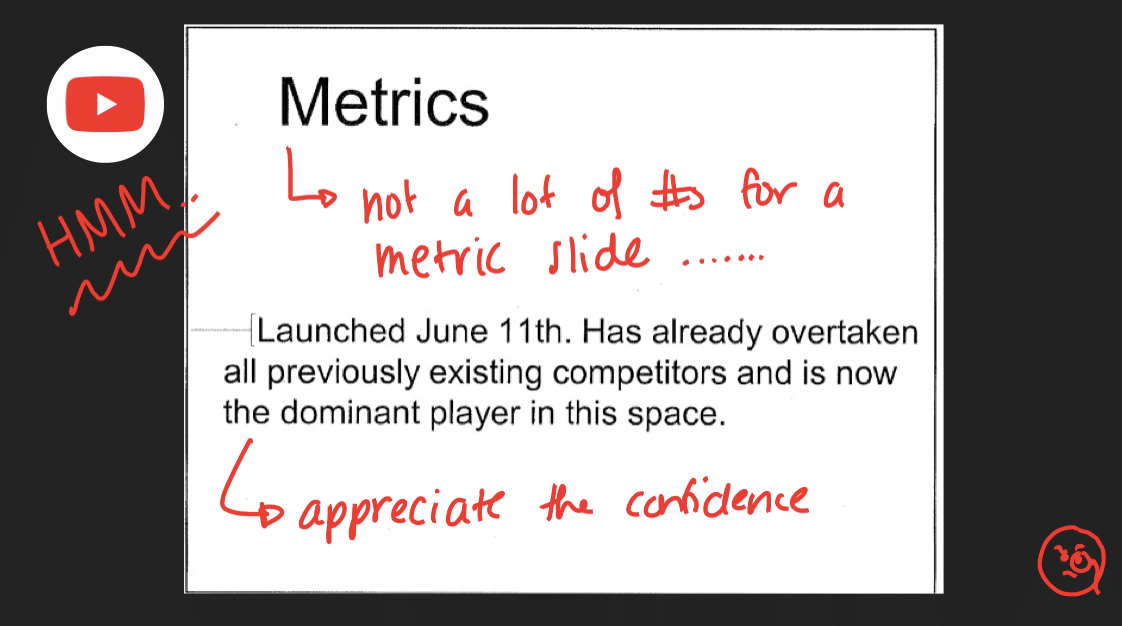
This metrics slide does not tell a clear story. Retrospectively, metrics had flatlined for YouTube at this point so they decided not to show any for this slide, and the fact that they shared a slide like this shows us they must have had investors already in the pipeline.
It would have been better for YouTube to be transparent with their metrics and not be overly confident. Even if your metrics aren’t incredible, make sure to be clear about what they are with your investors – they’ll find out in the future with their due diligence anyways.
Soundwave
2012: Raised $1M Seed
$2.9M in Total Funding
Acquired by Spotify
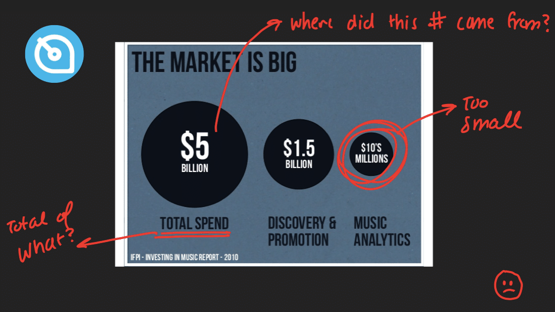
Soundwave has no context to where these numbers came from – for instance, where did this $5 billion spend come from? More than numbers, you should share metrics that help you tell your story.
Carta, formerly eShares
2015: Raised $7M Series A
$67.8M in Total Funding
Still Operating
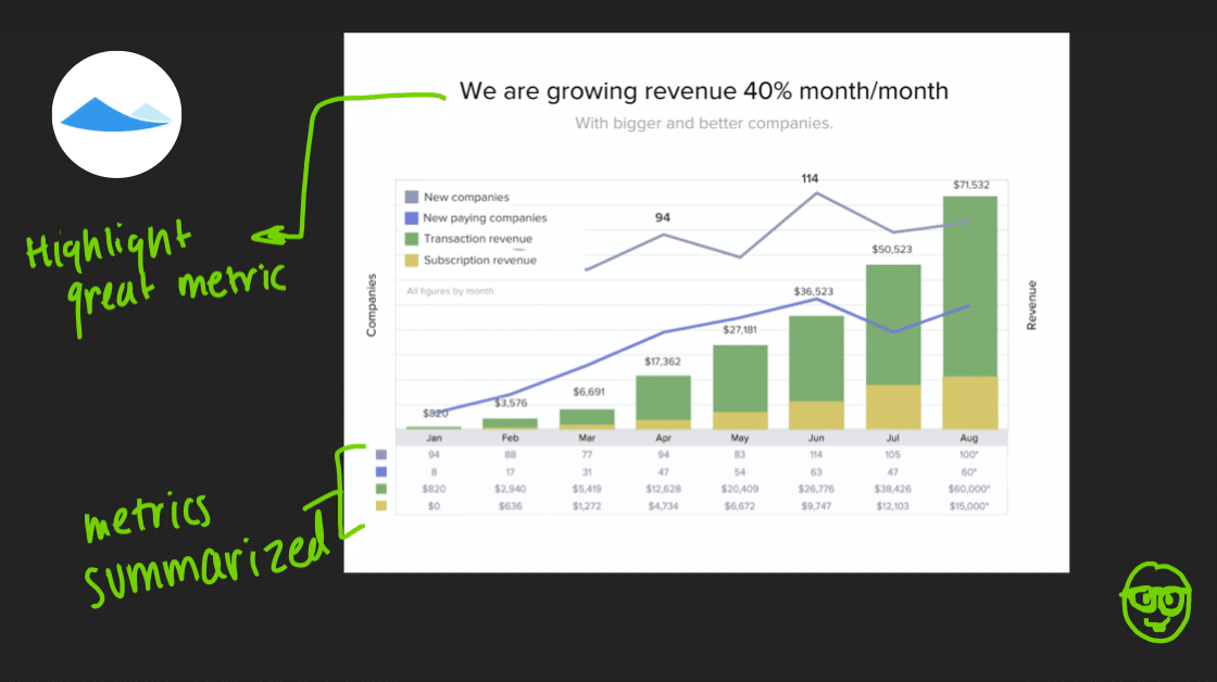
Just the top headline alone lets you know why this metrics slide is valuable. Another great thing about this slide is that they aren’t afraid to show negative data. Talk through any negative metrics in your investor meetings. Your transparency will create trust between you and your investors and will show you truly do understand your business and metrics. If you’re searching for a good sample pitch deck, this slide is worth referencing.
Front App
2016: Raised $10M Series A
$13.2M in Total Funding
Still Operating
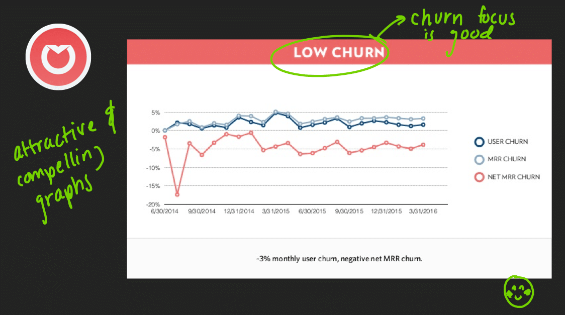
Talk about churn with your investors in your VC pitch deck! Even if your churn isn’t great, investors will discover it later on. Front App’s slide is another great example of honesty regarding metrics early on. Don’t leave anything hidden for investors to find out later.
8. Ego Flaunting
TLDR: You’re raising money, not finding a date. Emphasize your qualifications and expertise, not your looks.
Crema.co
2016: Raised $325K Seed
$325K in Total Funding
Still Operating
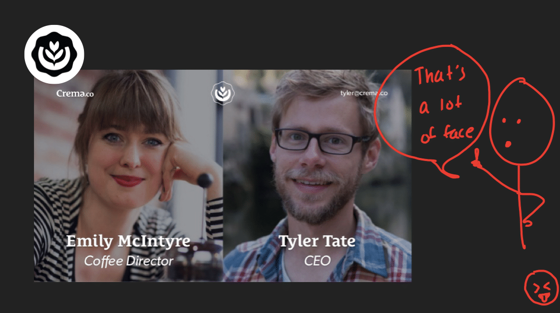
This slide tells us nothing about the qualifications of the team, all we know is that you have a nice smile. Again, no one cares what you look like. A team slide should show investors your experiences and qualifications for the position, not be a blown-up selfie.
TalentBase
2016: Raised $150K Seed
$150K in Total Funding
Still Operating
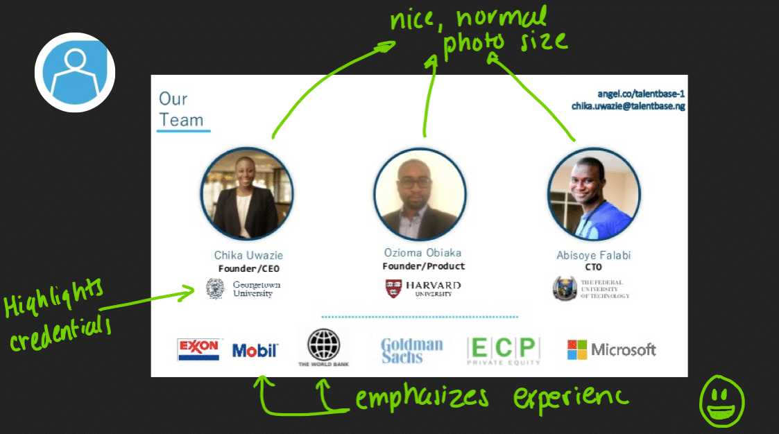
This is a great team slide. Investors can see where people went to school and their past relevant experience. Team slides are all about creating trust between you and your potential investor. They should focus on your experience and explain why the investor should trust you with their limited amount of funds.
9. No Demo Videos
TLDR: Don’t do demo videos – something can always go wrong. And even if it doesn’t? It’s still awkward.
Cubeit
2014: Raised $3M Seed
$3M in Total Funding
Acquihire by Myntra

Just the thought of this demo video gives us anxiety. For example, let’s say you press play, and the audio doesn’t work. Or someone video conferences in, and they can’t hear you. Or the WiFi goes down. All sorts of catastrophes await with demo videos.
Or let’s say everything goes well and the video plays – do you watch people as they watch the video (awkward), are you looking at your computer (everyone starts doing the same and checks their email) – so many uncomfortable times await.
Demo videos suck – just don’t do them.
Crew
2014: Raised $2.1M Seed
$9.8M in Total Funding
Acquired by Dribble
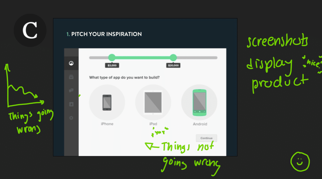
If you must do a live demo, use screenshots, or inVision to make it look like you are clicking a live website. A live demo lookalike without actually doing a live demo, what’s not to like! This investor deck example design is simple and to the point.
Our best advice for presenting an investor pitch deck? Try to do a live demo every time, for example, if you have drones, show them the drones in the parking lot. Just no videos.
10. Snoozefest
Wealthsimple
2014: Raised CA$1.9M Seed
$77.9M in Total Funding
Still Operating
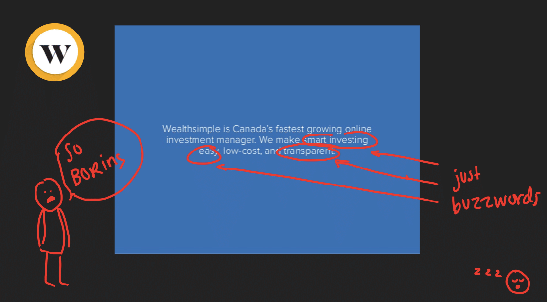
There is absolutely nothing interesting about this slide, except that you are based in Canada. And as much as we like Canada, it’s just not that interesting. Make your pitch deck design fun and engaging, because chances are that this is the 100th pitch the investor has heard today, and maybe the 100th pitch you’ve done.
Make your slides dynamic so you can have fun pitching and inject that dynamism into your presentation.
LinkedIn
2004: Raised $10M Series B
$103.2M in Total Funding
Acquired by Microsoft
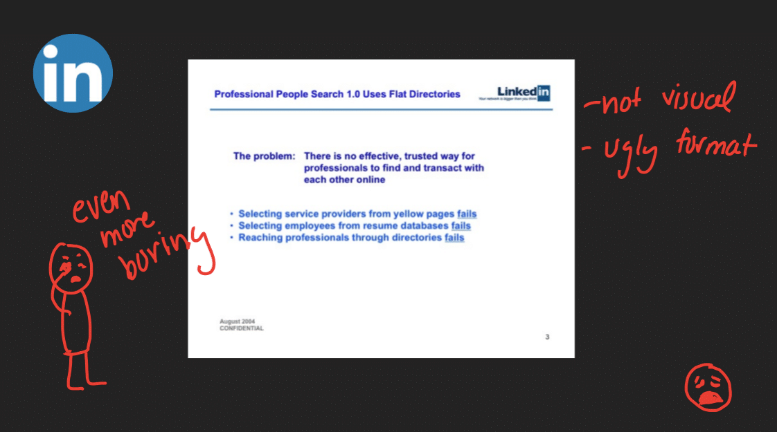
So we’ll hand it to LinkedIn. 2004 was clearly not a great year for sophisticated slides or the mecca of pitch deck designs. Additionally, this is an excellent example of a great concept, with an extremely boring slide. Moreover, this ultra-simple slide is not giving us the enthusiasm and excitement that it should, and would benefit from some visual aspects. This isn’t the deck template you’d expect from one of today’s leading social tools with millions of users.
Opendoor
2016; Raised $150K Seed
$150K in Total Funding
Still Operating
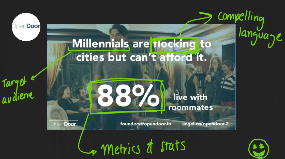
So this is a great slide and example pitch deck design. We are immediately drawn because of the compelling problem and the tangible metric. Additionally, investors can quickly see a pain point and a big opportunity. Opendoor also did a great job of picking a cool font and cool background that wasn’t too busy and still engaging. This slide gets investors excited, and therefore would ultimately get the pitcher fired up to tell the story and explain the pain points repeatedly.
10 Tenets of an Awesome Investor Pitch Deck
So finally we’ve walked through all the tenets of what makes a shitty investor pitch and walked through specific pitch deck examples. Now, to guide you the the process of creating your startup pitch template, here are all the tenets of what makes the best pitch decks:
- Easy to understand concepts
- Readable text
- Simple and clean visuals
- Concise
- Audience in mind
- Relax on the buzzwords
- Thoughtful metrics
- Ego out the door
- No demo videos
- Compelling
“Just because you get funded does not mean you are successful.”– Vinod Khosla, Founder of Khosla Ventures
At the end of the day, hopefully, you’ll raise money, but remember raising money doesn’t mean that you are in any way successful, all it means is that you have another breath of air. A fresh round of capital for your technology, platform, software, etc. can come with new growth benchmarks, expectations of success, new management, and a host of other unique pressures and challenges. The difference between industry leaders (10%) and failed startups (the other 90%) often comes down to how you grow, secure and manage capital.
You might also be interested in our Top 3 Presentation Templates for Junior Sales Reps article.
Once you do raise the money you’re looking for, be smart with how you spend it, and best of luck!
This piece is based on Crunchbase CEO Jager McConnell’s presentation on how to fix your bad investor pitch deck at WebSummit in Lisbon, Portugal 2017 and adopted for blog post format. You can see the full talk here. And be sure to check out the SlideShare here.
Did you know, Crunchbase’s all-in-one prospecting solution can help you find and connect with investors? With Crunchbase you can search for and follow investors, and even save investors you’re interested in to a list to track their activity with real-time alerts. When you feel confident enough in your business model to reach out, you can find contact information directly within Crunchbase. And, with our new engagement suite, you can include unique industry insights through snippets personalized to each recipient and send outreach emails directly from Crunchbase.

.svg)


.webp)
.webp)

