As profoundly significant as our raw data is, it’s not very good at telling us a story. Spreadsheets often leave us confused and unenlightened, overwhelming us with static data that blinds us to critical insights.
Sales data visualization brings numerical and textual data to life. Visual representation communicates raw data clearly and concisely, enabling sales teams to extract meaning from large volumes of data.
What is data visualization?
Data visualization is the graphical representation of data using visual elements such as graphs, charts, maps, etc. It transforms your complex raw data into an easily digestible visualization designed to identify trends, patterns, relationships, outliers and more.
Data visualizations tap into the fact that we respond to visual information quicker than textual information. Presenting data in a visual format can empower sales teams to make faster interpretations and deliver timely results.
It also facilitates effective communication with stakeholders and customers, who will likely engage better with your charts than your spreadsheets.
What type of data visualization should I use?
From bar charts to bubble graphs, there are many techniques you can use to visualize your data. The specific visualization you use for any given dataset will depend on the story you’re trying to tell.
Here are some of the most popular sales data visualization techniques.
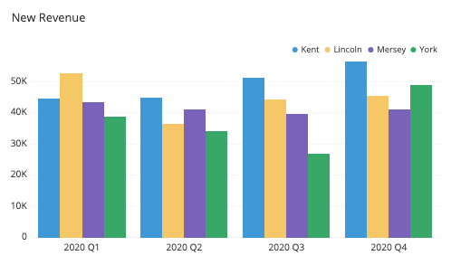
Bar charts
Bar charts are the most popular type of data visualization tool because they’re simple and easy to interpret. They’re used to compare quantities within related categories, such as the number of sales across years or customers by age. The x-axis highlights the categories, and the y-axis represents the value.
If you want to compare two or more values or identify your highest/lowest-performing activities, bar charts are an effective solution. Using stacked bar charts or grouped bar charts give deeper exploration, like the example below.
Pie charts and donut charts
Pie charts illustrate percentages as part of a whole. The chart is divided into segments or “slices” that represent numerical proportions, with the total sum of all slices always equal to 100%.
Pie charts work best for visually representing simple percentage data. For sales data visualization, this might be something such as monthly sales across your different channels or revenue generated from specific products or product types.
Line graphs
Line graphs are good for charting continuous data sets to uncover trends or relationships between variables over time. The data points are represented as dots joined by straight lines, aiding the visualization of historical and present patterns within datasets. You can see this easily in the visualization example below:
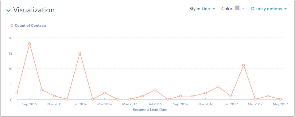
Line graphs can track the changes of multiple different groups in one visualization. For example, you might document the yearly sales of different product types within the same period or track your monthly revenue with one of your startup growth strategies. Just remember to use different colors for each category.
Scatter plots
Often used when datasets contain different data points, scatter plot charts show relationships between two variables. They often act as a visual aid for representing and identifying data patterns, trends, correlations and anomalies.
You might use scatter plot charts to visualize the relationships between average sales and the time of day or e-commerce sales and inflation.
Funnel charts
We’re all familiar with the marketing funnel and sales funnel, but did you know you can use the funnel method to visualize any sequential step? For example, you can use it to visualize your unique buyer journey, identify drop-off points and bottlenecks, or improve your sales pipeline.
Heat maps
Heat maps use color shading, gradients and saturations to identify differences in values. Usually, the darker/warmer the color, the higher or more intense the result. For example, the heatmap below makes it clear from a sales perspective that in 2016 a business’ Brooklyn store achieved the most sales, while their Staten Island store resulted in consistently low sales.
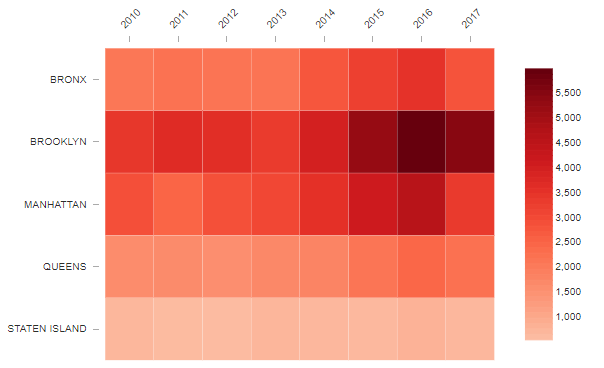
Heat maps are good for spotting intensities and trends as well as analyzing performance. They can be used for everything from rating values on a scale (i.e. customer sentiments) to location assessments.
How sales data visualization benefits your sales team
Big data is everywhere. And despite its increasing accessibility, raw data is still time-consuming to sift through. This is problematic for sales teams which should be spending as little time on analytical interpretation, and as much time on analytical application, as possible.
Data visualizations mitigate this problem. Here are some of the ways visualizations can benefit your team.
Improves metric and goal-tracking capabilities
You might only do yearly, quarterly or monthly reports, but that doesn’t mean you can’t consult your KPIs consistently. Data visualizations help you keep track of your goals and enable you to make swift goal-oriented business decisions, such as redesigning a poorly-performing landing page or contacting your growing number of idle customers as part of your customer retention strategy.
Identifies trends and hidden patterns
Performance analysis, pipeline analysis, market research analysis, forecasting–these critical activities depend on identifying trends and patterns. Data visualization makes spotting trends, patterns and outliers easier, increasing the speed and accuracy of business decisions.
Improves productivity
People process images much faster than text. Up to 600,000 times faster, in fact. Transforming your raw data into a visual format makes it easier to interpret. Complex data patterns, trends, relationships, etc., can be understood at a glance. This means teams can spend less time wading through data and more time applying it to real-world business decisions.
Improves sales reporting
Your sales reports need to be engaging, informational and actionable. Your team should be able to extract valuable insights from your report without trawling through a bunch of text. Data visualizations communicate your findings in a snackable fashion to improve report engagement.
If you’re using a Google Data Studio alternative, your sales reports can also benefit from perks such as direct data integration channels. This enables you to access and utilize channel-wide campaign data for your visualizations–right inside your reporting platform.
Top tips for executing sales data visualization like a pro
Before you get stuck into creating your first data visualization, here are a couple of fundamental best practices.
Choose the right type of visual
There’s no one-size-fits-all approach when it comes to data visualization. If you choose the wrong visual format, you risk confusing your audience and skewing their interpretations. So, when you’re considering which visual to use, ask yourself what story you’re trying to tell. For example, are you trying to:
- Show comparisons between two or more values?
- Document values over a length of time?
- Analyze trends or patterns?
- Highlight a composition?
All of these questions–and more–will dictate the type of visualization you choose. In your sales reports, you’ll probably use multiple visualization types to showcase different things.
Tell data stories through colors
Colors don’t just make your visualizations more aesthetically eye-catching. They also help accentuate specific information and distinguish different categories. This makes for a more intuitive viewing experience.
Pairing two complementary colors with a neutral color like gray or white is an effective way to create a clean-looking visual that is easy to interpret. Using intuitive colors (like red for warm and blue for cold) helps viewers process your data’s story faster. Take a look at the image below: the colors are so intuitive that we immediately know what the map represents without having to scrutinize the key.

While using the right colors can enhance your visualization, using the wrong colors can ruin it completely. Beware of using too many different colors to encode data and too many shades of one color, contrasting colors, or arbitrary colors. Remember, the colors you use should aid the telling of your data’s story; they’re more than mere aesthetic tools!
Keep it clear and simple
The whole point of data visualization is to take raw data–which is usually presented in a complex, unengaging way–and transform it into an easy-to-digest visual aid. If you stuff too much data into one graph or chart, you risk defeating the purpose of your visualization goals.
Less is more. Limit the number of categories you use in charts (between four and seven is a good rule of thumb). Omit information that isn’t essential to the immediate story you’re trying to tell. Don’t be afraid to use single-value charts to communicate straightforward data or to split your data into two separate graphs to improve clarity.
Strive to communicate your data’s story as succinctly as possible.
The takeaway
Sales data visualization empowers sales teams to easily decipher raw data and identify the trends, patterns, opportunities and threats that govern sales processes and goals. With the ability to quickly and intuitively understand complex data, sales teams can execute time-sensitive business initiatives and take advantage of sales-boosting opportunities.
Of course, for your graphs and charts to be impactful within your sales reports, they still need to be supported by text. However, for the swift delivery of actionable insights, visualizations are powerful solutions.
This article is part of the Crunchbase Community Contributor Series. The author is an expert in their field and we are honored to feature and promote their contribution on the Crunchbase blog.
Please note that the author is not employed by Crunchbase and the opinions expressed in this article do not necessarily reflect official views or opinions of Crunchbase, Inc.
Pohan Lin is the senior web marketing and localizations manager at Databricks, a global data and AI provider connecting the features of data warehouses and data lakes to create lakehouse architecture and azure data lake tutorial. With over 18 years of experience in web marketing, online SaaS business, and e-commerce growth, Lin is passionate about innovation and dedicated to communicating the significant impact data has in marketing.