Guest writer Holden Page is an editor of Crunchbase News, an independent news organization. For more on how Crunchbase News operates independently of Crunchbase, go here.
Crunchbase News is a little team with big ambitions. For entrepreneurs, investors, and Crunchbase customers, we attempt to narrate how private capital in upstarts today impact the most powerful and entrenched corporations tomorrow.
And while our publishing cadence—over 20 articles a week between four full-timers and two contractors—and our ability to break stories has proven that Crunchbase is the right place to tell those stories, Crunchbase News’s virtual home has been limited by a WordPress install that did not empower our readers, writers, and editors.
Readers were unable to find their way back to the Crunchbase News homepage, connect with us over social or email, or further share and explore all the other content we had to offer; Writers had difficulties implementing certain features in their work; and editors struggled to curate articles on the homepage and format posts.
What follows is what we improved. But before diving into what we made pretty, let’s talk logistics, which I often feel is an underrated aspect of launching a new website with a fresh look.
Budgets And Timeline
Crunchbase News calls a VC-backed startup home. That means we need to grow fast while staying conscious of two resources: time and money.
Money
In terms of money, our goal was to keep the website redesign in the five-figure range. To do this, we spent approximately a month going over the requirements we needed for the site, as well as spending time researching a base theme that would allow our chosen agency to shortcut elements of designing the Crunchbase News website.
We detailed every feature. This included WordPress “basics” such as including the author name on the post page. We also detailed back-end fixes to remove technical debt and make our WordPress install more stable and adaptable to future updates (such as the expected release of Gutenberg to WordPress core). It was also important to ensure our organic traffic stayed intact, and we also integrated elements such as Google Tag Manager to further our understanding of how readers use our site.
We managed to do all of this within the budget allotted. However, paying for a News website to be built is the easy part. Now we needed to complete it in a reasonable amount of time.
Time
Due to my experience working on WordPress websites for clients large and small, I was likely more aware than most about how much time would be needed to complete the website. Before we even approached agencies (aside: we cribbed John Doherty’s how-to on evaluating agency proposals once we reached that stage), we estimated in April that the website, under the spec outlined, would be completed by the end of July. We launched the website on July 31st.
But that wasn’t easy to accomplish, even with a pretty solid base to work from concerning WordPress development. News is integrated into the homepage of Crunchbase.com. We also generate large amounts of traffic, making us a target for bad actors. It was also necessary to preserve our URL structures and keep our Internet overlord, Google, happy.
To do this, three departments were intimately involved in the Crunchbase redesign: Operations (Gianni Argiris), Design (Li-Anne Dias), and News. Each department also had a variety of other responsibilities to tend to. Leadership outside those departments also needed to stay informed and feel comfortable with the change (such as our logo and top nav upgrade, as you will soon see).
Outside of internal departments, we had our design agency responsible for the build of the website and synced with our SEO agency, Local SEO Guide, to ensure traffic was preserved when we finally flipped the switch to the new website.
In short, it’s a lot of parties and expectations to manage. And I am incredibly thankful that each department and outside vendor we worked with not only was engaged with the News redesign project, but they also were very willing to make compromises when necessary.
A big part of what can make a website redesign go off the rails is when unreasonable expectations set in. It can lead to frustration, which may impact the momentum a project once had.
To avoid this, we outlined pretty clear rules of who owned what. Design, for instance, had final say on all design elements; Operations had final say on how integrations worked; News had sign off on the overall vision and owned the deadlines; and the agency had final say on whether something was technically possible or not.
But none of this really would have worked if there wasn’t a base level of trust. And that trust had to cascade.
Leadership needed to trust News that our vision of how a publication should be built was on point. My EIC needed to trust that I knew I was giving him the right information to inform budgets and get access to resources. News had to trust that design would follow through on vision. In turn, the design team needed to trust that we would defer to their judgment. Furthermore, News had to trust our agency that they would push to complete the work to spec. Meanwhile, our agency had to trust that we would be reasonable in working through a technical constraint that could put the budget and timeline at risk (as often happens in any web project).
In general, this worked out shockingly well. I am not trying to puff our team either. A huge amount of trust and effort between everyone made this honestly one of the best website builds I’ve ever been a part of. Heck, it’s a large part of why I feel motivated to write this post. That’s not to say we didn’t hit snags. In the last few weeks, we did almost every day. But everyone remained committed to the goal: building a better News experience for readers, writers, and editors on time and on budget.
Now that all the logistics are out of the way, let’s talk about what we improved.
Discoverability
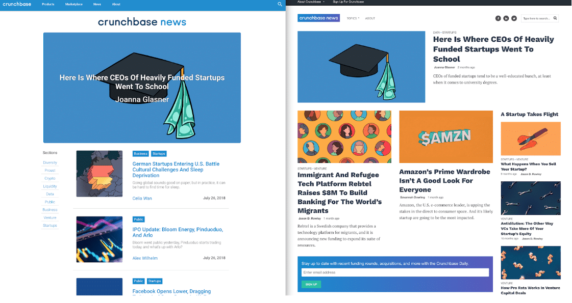
Left: former site. Right: new site.
Our previous version of the website, at most, showed three articles on the desktop. On some screens, the featured image was the only element you could see. Now, no matter your desktop screen size, you will at least be able to see that there is more content below the fold.
Furthermore, the former homepage lacked the ability for readers to follow us on various social networks or sign up for the Crunchbase Daily—both significant sources of traffic over the long term.
On the former version of Crunchbase News, you could view more posts by clicking on “Sections” to the left of the post list. Sections were often below the fold. We have renamed Sections to Topics and placed the links in a menu above-the-fold that persists across all states of the website (post view, search view, tag view, and category view). Since these screenshots were taken, we have also added our quarterly reports.
Navigation (Top Nav)
Formerly, Crunchbase News used the top navigation bar that persists across all Crunchbase properties. But we discovered it hindered our ability to give our readers the ability to read more articles on our site while also retaining the ability for our readers discovering news to go back to Crunchbase’s other properties. It also took up quite a bit of space.
We decided to employ a mega menu to resolve this conflict. Now, when you hover over “About Crunchbase,” a drop-down menu will appear giving you a full view of Crunchbase’s company mission, properties, and products in one view. Once your mouse exits the mega menu, it will automatically close, bringing News’s content and navigation back into full view.
Notably, this does not persist on mobile. The reason for this is pretty simple: it’s a more complex task to make mega menus react predictably across mobile devices. Such a task threatened our timeline and budget, making it a battle for another day.
Navigation (Mobile)
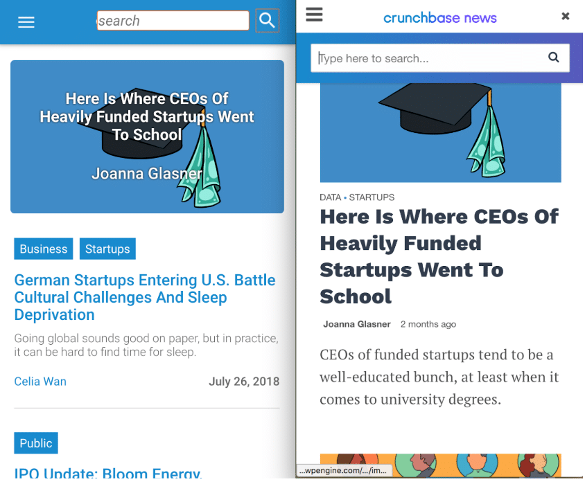
However, it’s on mobile where our former website suffered the most. There was no way to get back to the homepage of Crunchbase News, unless you clicked a series of menus through the top nav that persists across all Crunchbase properties. We also lost “Sections” on the mobile view as well. For various technical reasons, adding links to the former menu was not a simple task to accomplish.
To fix this, we made sure the logo on the new version of the website always persists and was linked to the Crunchbase News homepage. We also made sure that the search form did not block out the mobile top nav, opting to place the form below the logo.
The rest of the links to topics, venture reports, and Crunchbase products were placed in the hamburger menu.
New Features
Of course, editors and writers like to have new tools to play with. But one feature we are particularly proud of is helping readers identify links to the data we use with a CB icon, as seen below:
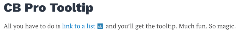
Nearly all of our major stories rely on Crunchbase data of some sort. This icon is another way of highlighting that for readers. Not only does this benefit Crunchbase, it also benefits our readers. Whenever possible, we should be transparent about the dataset we use in stories. A part of being transparent is making it clear where that data is coming from. It’s possible, in the future, we will adopt more customized icons to help readers go to the links that matter most.
Of course, that wasn’t the only feature snuck into the proposal. A more comprehensive view of the features can be seen in the screenshot below:
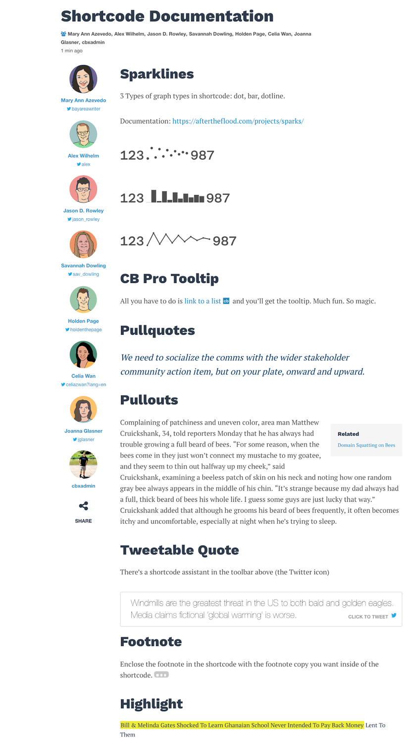
The News team is also now more empowered than ever to make changes to the website that don’t require hard coding. The homepage can be totally redesigned via a drag-and-drop editor. Our articles can be highlighted in a variety of ways.
The Future
Of course, there’s a lot more work we need to do. But the foundation has been built. We now feel confident in tracking metrics, eventually running A/B tests, and adding new features to our WordPress install to keep up with our (very large) competitors.
Most importantly, we’re not actually attached to this redesign. Yes, it’s nice. From wireframe to final product, it honestly turned out better than I expected (years of agency work will make one a touch pessimistic). And we’re going to wear it for a while.
However, now that we’ve worked with so many parties to build a successful web property, it’s already time to think about how we can do the next run bigger and better. With a stable install, and analytics trickling in, Crunchbase News is in a better position than ever to accomplish the next phase of development.